

What is web design?
Web design involves creating the visual elements and layout of a website, while coding involves translating these designs into a functional website using programming languages like HTML, CSS, and JavaScript. Typically, dedicated web developers translate the designs to code.
Adaptive Web Design
Adaptive web design encourages the creation of multiple versions of a web page to better fit the user’s device, rather than one static page that loads the same across all devices, or one page that reorders and resizes content according to device/screen size/user. user size/browser.
Example –
Shopify chose a different solution for its adaptive design. The company optimized the website and app in different directions on a “one size fits all” basis.
Shopify’s designers decided that with any screen size, their design elements should fit the screen the user is using. Therefore, to ensure that all users have a uniform interface. Shopify designed their site to work according to the screen size of the device. It also provided different CTAs and illustrations at different sizes and locations on the page.
While on PCs and tablets, Shopify’s CTAs and images appear to the right of the form, on mobile devices these elements are below and in the center. This adaptive design approach allows for a more diverse interface while maintaining an optimized interaction experience, regardless of their screen size.

Responsive Web Design
Responsive web design is an approach to web design that changes the look and feel of a website to suit different devices, window or screen sizes. Recent research considers viewer proximity as part of the contextual view as an extension of RWD.
Example –
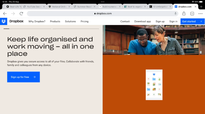
Dropbox’s web page is the perfect example of how responsive UX design can dramatically alter user behavior when used on different screen sizes. It takes responsive design to the next level by displaying what looks like completely different web pages depending on your device.
Here, we see three versions of one a landing page for smartphones, tablets and desktop screens:
Desktop

Tablet
Mobile

Opinion
In my opinion, responsive web design is more reliable as it has a huge plus in usability. Because of pages that are very similar on different devices.
По моему мнению, responsive web design более надежный, так как он имеет огромный плюс в удобстве использования. Из-за страниц которые очень схожи на разных устройствах.
Practice
An example of a page using rResponsive Web Design.
Code to use: HTML
<meta name=”viewport” content=”width=device-width, initial-scale=1.0″>
Code to use: CSS
img {
max-width: 100%;
height: auto;
}